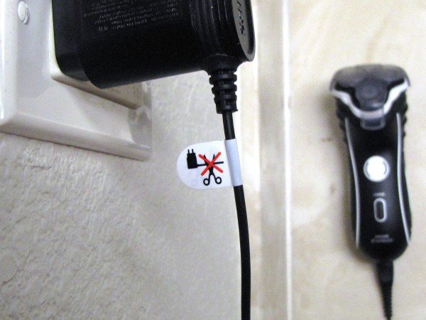
An extremely useful label…

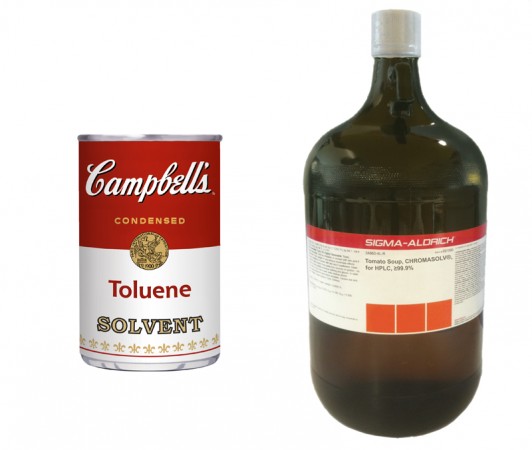
…on the charger for my new Norelco 7310XL. As near as I am able to interpret, it means, “do not cut this cord off.” The charger’s rated output is only 350 mA at 15V DC, which is scarcely hazardous; even if you were to cut the cord with uninsulated metal scissors, while it was plugged into mains power, the worst-case scenario is probably a noticeable tingle. Perhaps a cut, shorted cable could heat up and, eventually, somehow, cause a fire? If it were 1AM on Friday the 13th and you had just broken a mirror while chasing a black cat under a ladder in the process of killing an albatross?

Is it even a hazard warning at all?

I am now, in fact, almost so curious about the label’s purpose as to attempt exactly what it seems to forbid, just to see what happens. My charger will stop working—that much I’m quite sure of. But surely no one capable of operating an electric razor, in the first place, would be surprised at that outcome. What about all the other possible ways I could destroy the charger? If it needs a “do not cut off cord” label, doesn’t it also a need a “do not blast with a shotgun” label? Doesn’t everything else I own? “Hello, Norelco customer service? I vaporized my charger with a thermal lance and it stopped working. What gives? Shouldn’t there be a label or something?”

Galilean thermometer photobleaching

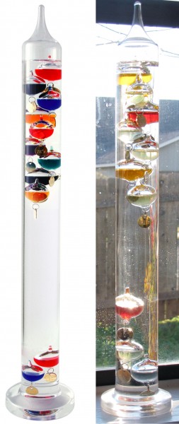
My brother bought me this Galileo thermometer (Wikipedia) as a Xmas gift in 2008. Out of the box, it looked very like the manufacturer photo shown at extreme left. The near-left picture was taken just today.

Over the intervening three years, it has been displayed continuously in one window or another, windowsills being not only useful locations to observe the temperature, but good places to show off the strikingly beautiful colors of the instrument. It was only a month ago that I noticed the blues and greens had faded away. I have noticed a similar effect in a pair of full bottles of Bomba energy drink that have also been kept in the sun (and for about the same length of time): the red is still red, while the blue has faded away. (Update: My memory of these bottles’ original colors was flawed. See this post.)

It’s likely the soda, at least, is dyed with Brilliant Blue FCF, aka Blue 1 (Wikipedia), and I wonder whether the Chinese-made Galileo thermometer also might have used the food-grade dye. It would be a sensible choice, for a manufacturer; with US consumption estimated at a million pounds a year, Blue 1 is dirt cheap, and obviously nontoxic, which the underwriters probably favor against the chance of an accident in which the thermometer breaks and the stuff gets into a human orifice or wound.

My standing desk setup

It was Nomadic Furniture that first got me interested, almost a decade ago, in the idea of working standing up. I’ve tried several times, since then, to pick up the habit, but only over the past six months, or so, have I finally made it stick.

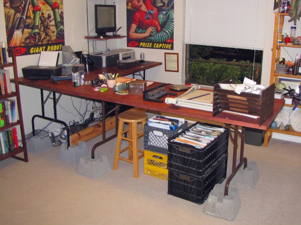
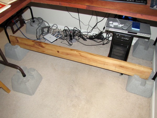
I built these two work tables from old card table legs, hollow-core doors, and extra-short molly bolts soon after moving into my current home, and published a Make: Project about it right after they were done. In spite of naysayers who believed hollow-core doors were too flimsy for this purpose, both tables have held up great, and are still going strong.

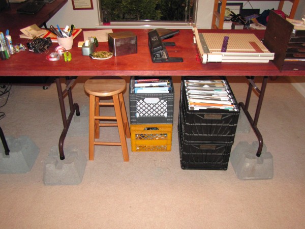
When, eight months ago, I was inspired by Mark Frauenfelder’s standing desk experiments to try it again, myself, I didn’t want to spend a lot on new furniture, or make any irreversible changes to my hollow-core door tables (which I am still quite fond of) in case it didn’t take. I had four of these cement “Dek Blocks” on hand for another project, and I decided to try simply setting one under each table leg, which had the effect of raising the work surface by about 6″, to 35″. This proved to be a very comfortable working height for me. Getting the monitor up to eye level on a wall-mounted shelf was also a critical change.

I have also found, per Benjamin Palmer’s suggestions as quoted in Mark’s follow-on post, that a barroom-style footrest or -rail is helpful for long term comfort, and the Dek Blocks also, by happy accident, provide a convenient means for adding one, as shown: Just slot a 2×6 (or other 2x nominal-dimension lumber) into the promolded slots in the front pair of Dek Blocks. Between the grooves in the blocks and the table legs themselves, gravity alone is sufficient to secure a footrail, which can simply be lifted away as necessary, e.g. for cleaning or maintenance access.

I now comfortably work from a standing position about eight hours a day, five days a week, and find it noticeably improves my attention span, energy level, mood, and overall health. There was some discomfort during the adjustment period, but, being a bit older and wiser this time, I didn’t try to just throw out my chairs and go from sitting all day to standing all day all at once. Rather, I worked up to it, starting out at just two hours in the morning, then going all morning until lunch (for awhile), and from there to standing up, all day, from 8AM to 5PM, except during my lunch hour. Done piecemeal like this, the transition was not uncomfortable at all.

Laser-cut Escher lizards

Back in 2008, I posted vector art for an hexagonally-tessellating lizard tile closely based on M.C. Escher’s famous design. Last week, my pal Angus Hines laser-cut a bunch in fluorescent acrylic. Each is about 3″ across. I just cross-posted the vector art on Thingiverse.

Bill Hicks “I don’t do drugs” 6-way message pen concept

I made this animated GIF for a forthcoming MAKE post about personalizing these rotating “message” promotional pens to make super-cheap, memorable, functional gifts for friends. But then I stopped short of actually using it, (at least with this particular set of messages) because I don’t want to have to fend off a bunch of enraged comments about a “pro-drug” message.

In point of fact, I like this classic stand-up line from comedy God Bill Hicks not so much because I am particularly drug-addled, nor even because I think it’s such a great knee-slapper, but rather because I admire its rhetorical craftsmanship. Properly delivered, it manages a complete semantic one-eighty in the course of twelve words—eight if you allow for the fact that the first four, “I don’t do drugs,” really just establish the starting point.

It’s one of those jokes that almost has to be spoken, to be effective. Even the most artful and creative punctuation fails to capture the effect in written words, because the speed at which most people read gives little time for anyone to be surprised between the first of those dozen words and the last.

But the 6-way message pen with its time-delayed, line-by-line scrolling marquee, opens up a new dimension not available in straight prose, and can make the joke work again, IMHO. And it was too good an opportunity to pass up.

My favorite spray bottle

I have had this clear blue, spherical, plastic misting bottle for twelve or thirteen years. I remember paying $8.99 for it at Target, I think, in 1998 or 1999. It was one of the first objects that ever made me pay attention to product design as an aesthetic activity. I went through a period thereafter where I was infatuated with expensive mid-century “modern” design and furniture, and bought some stuff in that vein. But all that snobby crap is gone, now. My $9 spray bottle remains.

I actually upgraded it, slightly, at some point, by replacing the “factory” rigid plastic suction tube with a piece of flexible vinyl R/C model fuel line with a brass R/C fuel filter at the end. This mod was a significant improvement, because the flexible, weighted line seeks the lowest point in the reservoir and so continues to draw water even when the sprayer is held at odd angles. Plus, the fuel filter helps keep grit and dust out of the sprayer mechanism, and hopefully prolongs its life.

I’ve recently discovered the brand name is “Tolco Mistaround.” They were manufactured in blue, red, green, and “smoke.” Though a bit hard to find, they are still for sale here and there on the web.

Concrete bowl with bottle glass aggregate

Last Spring I got it in my head to make a concrete bowl. Mom had a book—Concrete Crafts by Alan Wycheck, specifically—with a project for a bowl made by casting concrete with colored glass fill between two cheap stainless steel mixing bowls, and we decided to try it.

I had a bunch of blue and green glass bottles on-hand, and broke these up by submerging them in a big galvanized washtub and bashing them with a fence-post driver. The water works nicely to prevent flying shards. Once the glass was pounded down to about US quarter-size, on average, we dumped the washtub out onto an old bedsheet on the lawn, in the sun, and gathered up sheet and glass together when everything was dry. We didn’t bother to remove the labels, first, which proved to be a mistake, in the long run, because we were picking bits of paper out of the glass for most of the rest of the project. It was an annoyance, not a critical error, but in hindsight I’d recommend spending the time to take the labels off, first.

We mixed up the concrete per Wycheck’s recipe (2:1:1 glass:sand:Portland cement, by volume, plus water to “taste”), spritzed the inside of the large bowl and the outside of the small bowl with generic “mold release” from Hobby Lobby, and dolloped in a generous portion of the wet mixture before inserting the smaller bowl and compressing until concrete oozed out around the lip. We set the stacked bowls in a corner of the porch, covered them with a soaking-wet towel, covered that with a plastic garbage bag to hold in the moisture, and weighted everything down with a pair of cobblestones. Then we left it for week. (Concrete gets harder the longer it stays wet during curing.)

The following weekend, there were a few tense moments when it seemed like the mold would be impossible to open without destroying its contents. But repeatedly dropping the stack on a towel spread over a cement patio floor, from a height of a few inches, eventually worked both inner and outer molds loose and a cleanly-molded concrete bowl popped out.

The instructions in Wycheck’s book, at this point, advise the reader to “sand or grind the surface to expose the glass.” In practice, in my experience, those nine words entail about 95% of the time, and 99% of the physical effort, expended in the project. I spent about 20 hours, all told, over the course of several weeks, working over the outside of the bowl, using an auto-body grinder with a six-inch-diameter flexible rubber pad and a set of diamond-impregnated abrasive pads, to achieve the results shown here. I turned the bowl upside down and fit it over an old barstool so I could work on it standing up.

These diamond polishing pads were not available locally, and had to be ordered online. They came in a set of eight grit sizes ranging from 50 up to 6000 grits, attaching by Velcro to a hard rubber pad threaded for a standard grinder arbor. That hard pad very quickly overheated, the first time I tried to use it, causing the adhesive holding the Velcro on to melt and the Velcro layer to come loose from the pad. When I complained about this to the seller, fortunately, their response was really outstanding: They sent me a new, soft rubber pad, for free, explained how I could fix the broken one with rubber cement. I had no problems with the soft replacement pad throughout the remainder of the project and, indeed, the hard one was good as new after the recommended repair.

With my equipment problems resolved, I set to with the grinder. I spent about 10 hours at the largest (50) grit size, just grinding away the so-called “cream” to expose the glass, and then worked down to smaller and smaller grits, spending about two hours each on 100, 200, 400, and 800 grits. There was a really striking improvement in the step from 400 to 800, and for a day or two I fully intended to polish the whole bowl all the way out to 6000 grit. But then I lost patience and just applied a polymer sealant, specifically Arrow-Magnolia International’s Glo-crete (some of which was leftover from my condo renovation), inside and out. This provided a nice, shiny, “wet-look” gloss.

I’m quite pleased with the finished product, which I gave to Mom as a gift.  But damn. It was much, much, much more work than I’d planned on, and I feel like Wycheck’s book should’ve done a better job of preparing me for the time commitment, and of providing guidance about the specialized equipment that would be needed to get it done.

Why it’s OK to design, make, sell, buy, own, and/or use a brush that looks like a mushroom

In case that question has been keeping you up at night, as it has me.

Quite seriously, now, because this is literally a matter of life and death for your entire family: I find this object interesting from an aesthetic perspective.

At first glance, of course, it’s easy to lump brushes that look like mushrooms together with tape dispensers that look like elephants, fireplace lighters that look like giant matchsticks, pocket knives that look like spaceships, and similar “looks-like” product designs that are at best “cute” and at worst anti-functional or even dangerous. In the past, I have referred to such products as “pseudomorphs,” mostly because “stuff what looks like other stuff, what it ain’t” is unwieldy and not as impressive. But that’s basically the idea. I dislike decoration for its own sake, especially in utilitarian objects, and find going out of the way to make a tool look like some object from nature, for instance, to be especially frivolous.

However, this “mushroom brush” is an interesting exception, a rare example of functional pseudomorphism. Consider: As any mycophile will tell you, fresh mushrooms (especially exotic varieties) should not be washed, in order to best preserve their flavors. To remove dirt and other debris before preparation, brushing is the preferred method, and to keep things hygienic one should dedicate a brush to the purpose. You do not, after all, want to clean mushrooms with the same brush you use to scrub dishes or clean under your fingernails.

And to avoid confusing your mushroom brush with these other, lesser, nastier brushes, it should be distinctive, somehow. You could label it, of course, perhaps with the words “mushroom brush,” but then you’re reduced to written language, which only works when everyone is literate in the same one. But what about children, illiterate adults, and/or the French? What about your potential mushroom-brush customers in all those other, lesser, nastier countries of the non-English-speaking world? You can add a bunch of labels in a bunch of languages to every brush, or you can sell a bunch of differently-labelled brushes in a bunch of differently-labelled countries, or you can do away with using words altogether and just make the brush, itself, look like a mushroom, and thus unambiguously identify its function.

In other words, mushroom brushes that look like mushrooms are functionally superior to those that do not. Even a mushroom brush that is labelled with a picture of a mushroom is not as good, because, while that picture-label could conceivably be overlooked by a person in a hurry to find a brush to clean the toilet (as one so often is), no one is going to attempt to use a brush that actually looks like a mushroom without noticing the fact.

Whew. I think I might be able to sleep, now.

And if, tomorrow morning, when I reach for my mushroom-shaped mushroom brush to tenderly waft away the clinging flakes of loam from my daily pound of breakfast morels, I should take the tiniest bit of childish pleasure in the fact that my brush looks like something what-it-ain’t, well…I guess that might be OK, too.